Stellenbosch University Maties
The name Maties has been associated with Stellenbosch University for many years, but before 2002 there was no logo or a specified writing style. The name appeared on bumper stickers, clothing and other promotional items, but there was no uniformity or recognisable visual identity.
The framework for the management of the corporate identity at Stellenbosch University makes provision for a level, which encompasses the non-academic student activities such as sports and societies. The contemporary Maties identity has especially been designed for this level, as a further extension of the University’s corporate identity.
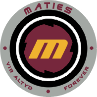
The new circular logo with the M in the middle is a strong, modern emblem, representative of a dynamic environment. The traditional maroon and yellow have been blended with the modern black and grey. These colours, combined with the slogan vir altyd / forever, simultaneously symbolise the Stellenbosch traditions and its vision for the future. It contains a strong sense of student fun and games, and therefore the application of this logo is less formal and rigorous than the corporate logo or crest.

- Together the logo and the logotype form the unique Maties signature.
- The ‘M’ in the new logo signifies Maties with strong associations of modernity, strength and fun.
- The circular device creates a strong sense of dynamism and contemporary evolution.
- The maroon and yellow have a traditional association with Stellenbosch University. The black, grey and new yellow (pantone 143) add a modern touch.
- Both the logo and the name are registered trademarks.
- The composition of the corporate signature is precise and intricate and the correct application is essential to the visual impact of the symbol. Even a slight deviation from the standard form or the specified applications can seriously diminish the visual effectiveness of the logo.
- The application of the logo should be consistent and should never be displayed in configurations and colours not shown in this manual.
- The slogan, vir altyd / forever signifies the tradition and vision that Maties stands for.
Maties Logo
| TO DOWNLOAD A SPECIFIC IMAGE, “RIGHT-CLICK” ON THE IMAGE AND SELECT “SAVE IMAGE AS…” | |
|---|---|
| Maties Stand Alone |
Maties Stacked |
Maties Horizontal |
Maties Shield |
Maties Typography Maroon |
Maties Typography Maroon (Shadowed) |
Maties Typography Grey |
Maties Typography Black |


